I LOVE the look
Moderator: ACOT Employee
I LOVE the look
of these! I mean REALLY love! But I have a hard time with letters that aren't all the same. I mean I can mix and match alphas within a title (different words different alphas) but I struggle hard with the multi ones. Have you guys used alphas like this? If so, care to share here?
SUS
- redsonic20
- Cherry Cropper
- Posts: 11966
- Gallery: 116
Re: I LOVE the look
They are darling, but my worry is that you won't have the colors you need even if you have the letter when you get to the end of it. Plus they are harder to coordinate. I wish they did this look in smaller alphas. I have the mix and match set from a while back and still haven't used it because the letters themselves are in some instance, multi colored. Talk about hard to make go!!
There ones want to jump in my cart, though. The different fonts make it look like they are more than there actually are but I refrained for exactly the reasons I stated. It will be hard not to get them, though!
- Charleneanne
- Cherry Delight
- Posts: 31699
- Gallery: 1500
- Location: Central Valley California
Re: I LOVE the look
I have no problem mixing and matching alphas from all different lines and fonts anytime. Just so long as they are in the same color palette like for instance fall, or primary or pastel etc. Not sure if that is shabby chic, ransom style or just tacky on my part. lol
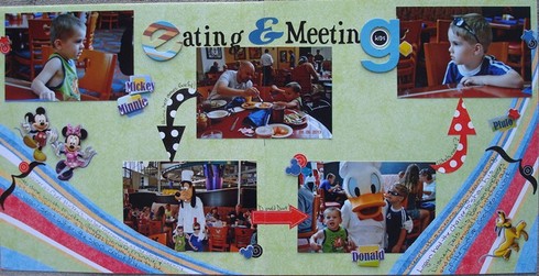
Charleneanne https://sbing.com/i/gallery2/481754-700.jpg
Re: I LOVE the look
You know what? Those would be perfect for this months 'Graphic Design' challenge.
***Berta***
- scrappinmom99
- Chocolate Covered Cherry
- Posts: 9758
- Gallery: 1370
- Location: NYC
Re: I LOVE the look
I find these a little intimidating as well. I did this layout and used the colorful letters on a black background, hoping that would make them "go" more with the bright colors of the paper and not be matchy-matchy (because they were not even the same manufacturer as the paper or of the big monogram letters). I figured the more colors I threw at the paper, the better ROFL!!!
Happy Scrapping!
Anne-Marie
Anne-Marie
Re: I LOVE the look
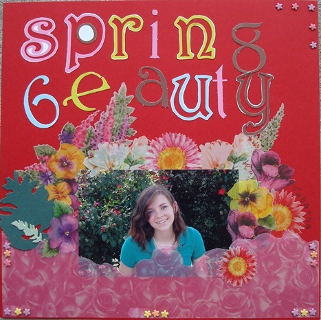
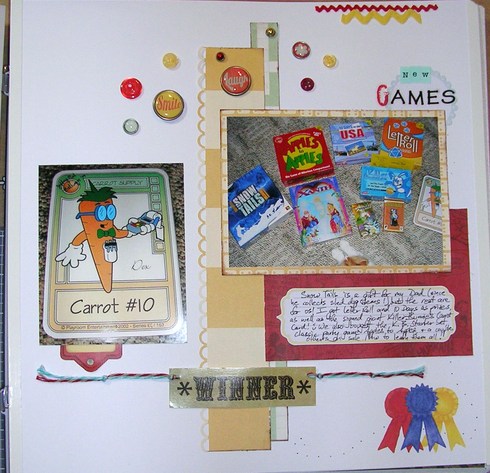
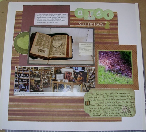
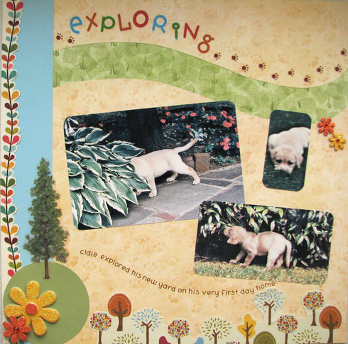
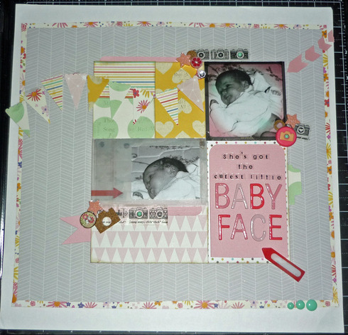
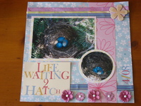
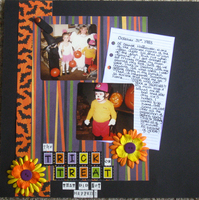
Me too, lol. I gave up on matching letters long ago, when I got fed up with half used alpha sheets all over the place. I'm teaching the kids my random ways too.Charleneanne wrote:I have no problem mixing and matching alphas from all different lines and fonts anytime. Just so long as they are in the same color palette like for instance fall, or primary or pastel etc. Not sure if that is shabby chic, ransom style or just tacky on my part. lol
Re: I LOVE the look
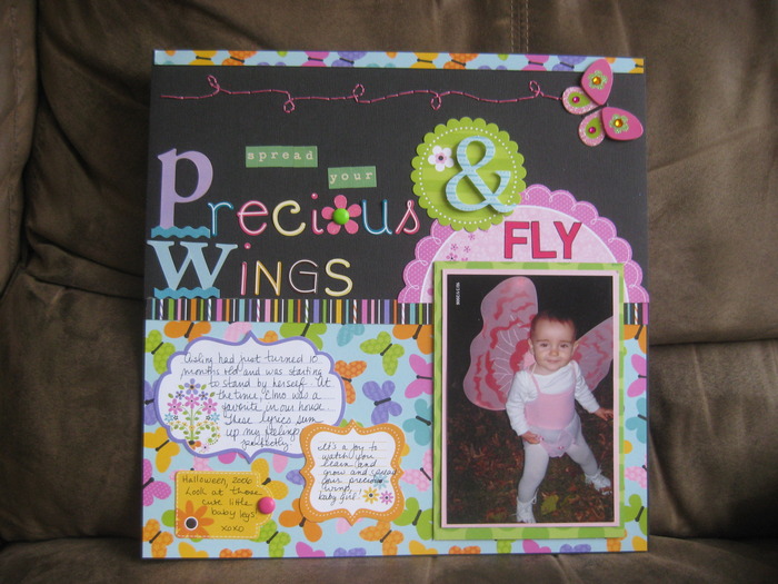
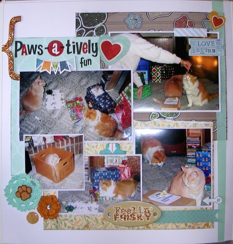
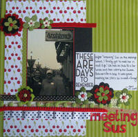
Gorgeous! I love the bright letters on the dark background, too.scrappinmom99 wrote:I find these a little intimidating as well. I did this layout and used the colorful letters on a black background, hoping that would make them "go" more with the bright colors of the paper and not be matchy-matchy (because they were not even the same manufacturer as the paper or of the big monogram letters). I figured the more colors I threw at the paper, the better ROFL!!!
Re: I LOVE the look
Those alphas are cute, though personally I have a hard time mixing alphas.
Karrie
- writerlady
- Bowl Full of Cherries
- Posts: 20573
- Gallery: 448
- Location: Southeast Connecticut
Re: I LOVE the look
Sus and Denise - I LOVE THOSE THICKERS, now I want both sets!!!
Karen in SC
2-page, multi-photo scrapper
Re: I LOVE the look
I love those. The only trouble I have with multi colored alphas is I don't want 2 of the same colored letters side by side. Sometimes that happens especially if I've already used some letters.
Jill
Jill
Jill
Re: I LOVE the look
it makes me feel better that other peeps feel it is hard to use those types of alphas!! Awesome examples! Anymore? I am still sitting on the fence debating to buy?!?!
SUS
- Cherry Tart
- Posts: 48
Re: I LOVE the look
I usually use the mixed color fonts in a single word. I scrolled through my blog for examples:
Re: I LOVE the look
I have a lot of old mini alphas from CM that are mixed colors - I usually tried to pick out all of one color for something, but yeah, you do end up w/uneven stuff left. But there are ways to get around that... use something different/larger for the first letter, alternate 2 colors throughout the word(s), etc. Here are some examples I found in my Gallery - this 1st was a title sticker but you can see how they did it & it looks great!
In this one I gave them the same background, though the letters themselves are different colors:
Re: I LOVE the look
I have a lot of alpha sets like that, especially baby themed ones that I used in Maddie's baby album...
And I have this set that I used in Cider's album...
- ScrappyDistractions
- Cherry Bing
- Posts: 2134
- Gallery: 854
- Location: Princeton, TX
Re: I LOVE the look
I so know how you feel - I am the same way. I just can;t do different colored letters. I see it work for some but I'm not one of them. I'm looking forward to seeing what some people do with this set 'cuz they are cool.
Lisa - Scrappy Distractions