Hi ladies
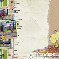
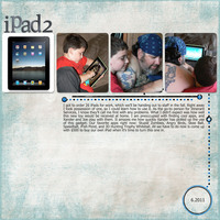
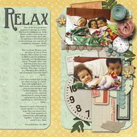
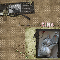
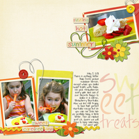
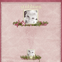
This months contest is hosted by the Digi CT and what better way is there to describe the contest theme than with some fantastic examples?!
The theme is all about balance. Create a layout by balancing your page elements on two opposite sides of the page.
Here are the contest rules:
One entry per person.
Must be a new, digital or hybrid layout/project.
Post your layout in the August Digital Contest gallery.
Winner will be announced within the week after contest ends.
You are not eligible to win if you were the previous month's winner.
Winners will be selected by the digital Creative Team.
Winner will receive a GC to the Digital Shoppe.
Ooh - this is a true challenge for me. I'm not good at this. Can you explain it a little more? I don't see the balance in one of the layouts above.
Sandy, I'll try and help. From my understanding, it would as if you were to fold your layout in half either way. So, you have a clustered at the top, then add a cluster at the bottom. They do not have to equal in size. It just gives it a more balanced feel. You could also take this thought and go left side/right side. If you don't do clusters you could try using the title on the other end. There's also the pictures like I did with them on opposite sides. Does that make sense?
Brittney gave a perfect description! Most of the example pages above are more physically balanced while one or two are more visually balanced. The "opposite" sides could be top & bottom, left & right, or diagonal corners too. Also, it doesn't have to be an exact mathematical split, rather the visual balance of a element one this side and another element on that side. You could have a larger element on the left and a smaller accent on the right, and still create that visual balance.
Some of the pages have elements that may fall into the center or fully reach across to the opposite side, but those tend to be background elements that support the main focal parts of the layout. Does that make sense?
ooh this looks like something i might be able to do, how long do we have. * sorry for the blondness *
Thank you ladies! I guess I'm just struggling with the 2nd one above. In what way does the circle below balance the top? I am trying to learn... and grow in my digiscrapping. Thank you again!
writerlady wrote:Thank you ladies! I guess I'm just struggling with the 2nd one above. In what way does the circle below balance the top? I am trying to learn... and grow in my digiscrapping. Thank you again!
I am looking at how the circle at the bottom balances diagonally with the photo of the iPad 2 at the top opposite corner.
writerlady wrote:Thank you ladies! I guess I'm just struggling with the 2nd one above. In what way does the circle below balance the top? I am trying to learn... and grow in my digiscrapping. Thank you again!
good eye and great question!
I chose that layout as an example because it shows that balance does not necessarily mean page elements with equal weight. Does that make sence? The circle definitly does not have the same dimensions as the row of photos along the top. I honestly didn't see the diagonal aspect, thanks for pointing that one out too Barb.
so so excited...just got home today--have been in KS with Carmen, my new gd--have hundreds of photos to scrap...might be up all night long!!!
great challenge, CT!
Lori aka "Mima"
Cherish Every Moment; Then Scrap Each One!
and
Sweet Spot Designs!!
Lori aka "Mima"
Cherish Every Moment; Then Scrap Each One!
and
Sweet Spot Designs!!
Information
Moderators